Why Pantone's 2020 Color of The Year Is The Wrong Choice
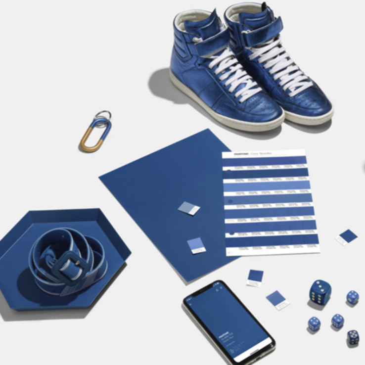
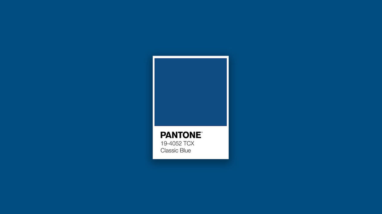
Pantone recently announced PANTONE 19-4052 Classic Blue as their 2020 Color Of The Year. Vice President of the Pantone Color Institute, Laurie Pressman, said this color offers calmness, stability, connection and reassurance as we head into a new decade. But is calmness really what the world needs and do we feel reassured? I’m not so convinced.
For more than two decades, The Pantone Color Institute has announced a “Color of the Year” in which it looks at global trends in design and culture and projects a color to inspire the year to come. In 2019, Pantone elected the vibrant, yet mellow PANTONE 16-1546, Living Coral, meant to embrace us with warmth and nourishment to provide comfort and buoyancy in our continually shifting environment, and in 2018, they chose Ultra Violet, PANTONE 18-3838, to communicate originality, ingenuity, and inspiration to take us forward.
But I’m curious if this “Classic Blue” and the calm, anti-stress, reassurance vibe is the right choice going into a BIG 2020 year. This is because both globally and locally, we have some major issues to address. Whether it’s the rise of right-wing political governments, climate change, wealth inequality, data misuse or genocide, I believe it’s not time to be calm or reassured, but to be resilient.
Admittedly so, Pressman stated the world is in an “unstable place” explaining: “Many of us looked at 2020 as the future, but now we’re here.” “Here” is an admittedly unstable place. Social media sucks our attention and breeds anxiety. We’re so connected, yet our relationships are suffering. Global politics is in great unrest as dictators make a comeback. The truth is being challenged by mass propaganda machines and amid all this, Pantone was faced with deciding which color best expressed the zeitgeist—a tradition now in its 20th year.”
Yet, to address the chaotic world, Pantone chose to go back to the “Classics” with a Classic Blue “Instilling calm, confidence, and connection, this enduring blue hue highlights our desire for a dependable and stable foundation on which to build as we cross the threshold into a new era.” This Blue was also meant to be linked to their 1999 choice (also Blue) saying the world was in an unsettling place in Y2K because of the uncertainties around computer systems heading into the 2000s. Pressman stated:
“We landed back on the blue family, where we’ve been and where we are. Just not knowing where to go and who to trust this blue is the feeling of calm and reassurance that help us have that confidence to move forward.”
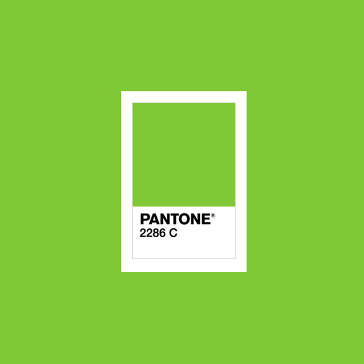
However, not knowing where we are, where we are going and who to trust does not seem very calming or reassuring at all and with the current political climates across the globe, “moving forward” is now a term less favorable to the “classic” or nostalgic “Make America Great Again” / Brexit / Frexit movements. At this period in history, I would argue that we can’t and we shouldn’t go back to the “ good ol’ days.” There are too many things at stake. We shouldn’t be calm. We shouldn’t be confident or comfortable. We should be resilient or able to withstand or recover quickly from difficult conditions. We must realize the state of chaos we are in and take steps forward to become resilient. To be resilient we need energy, we need courage, we need determination and we need persistence. So with that, I will energize you with my own 2020 Pantone pick, PANTONE 2286 C, in which I am calling Action Green. Whatever energizes you, whatever deed big or small you can do. Let’s do it. I hope 2020 brings the strength and inspiration to make your difference, make your contribution, make your impact.
Fonte: noqcreative